Resurrecting the roots of a brand
JFKU full website rewrite
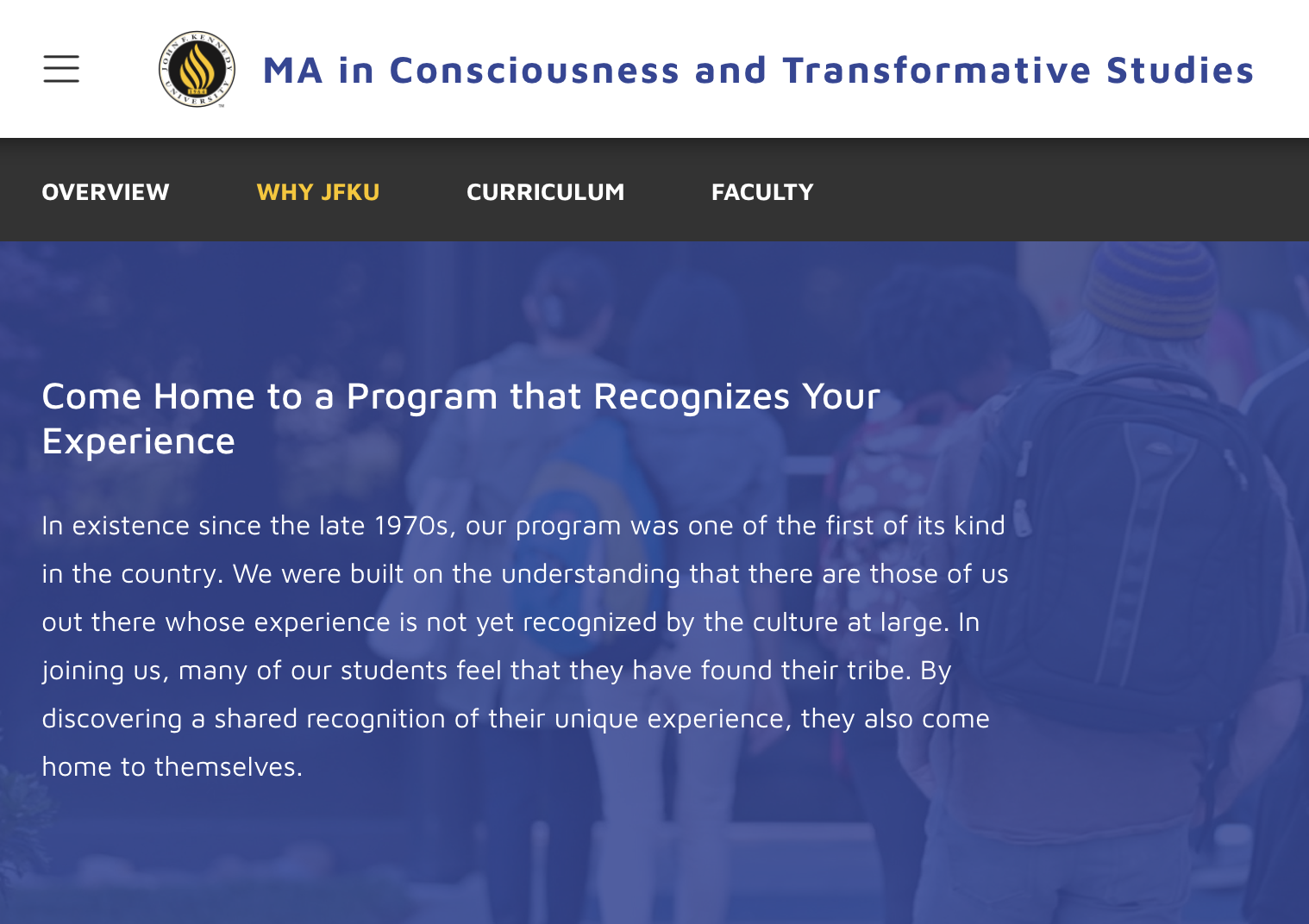
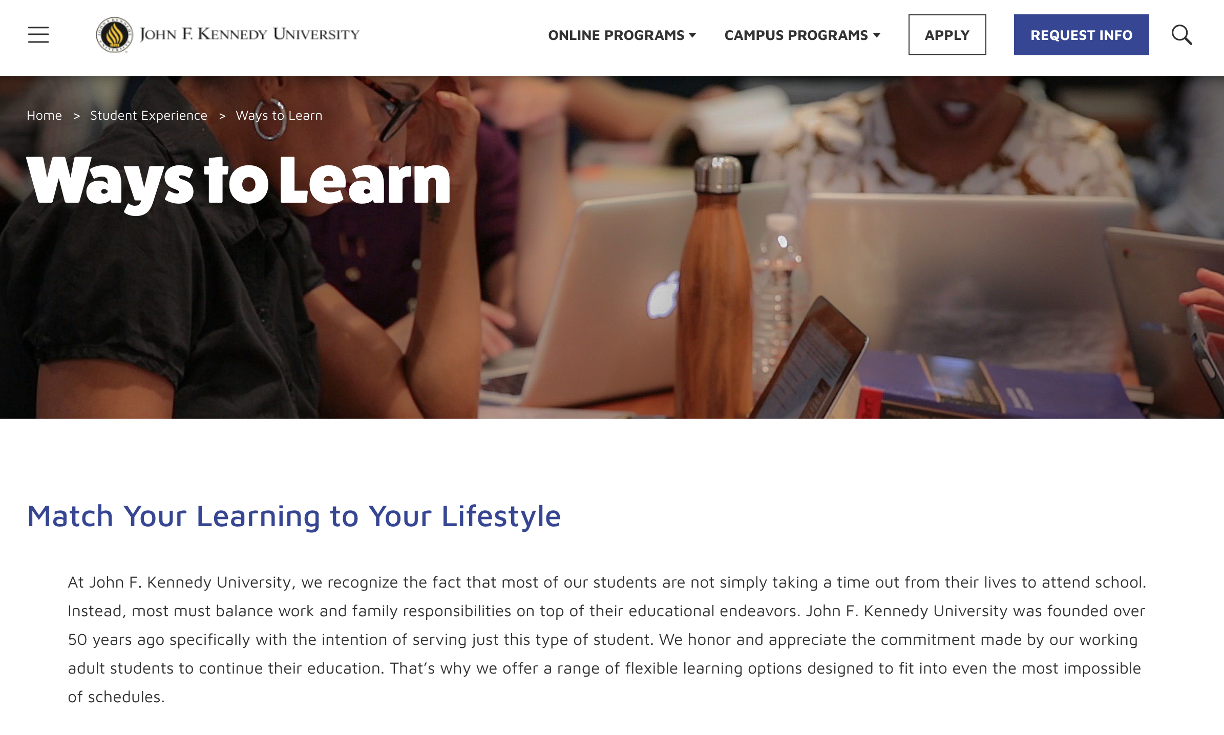
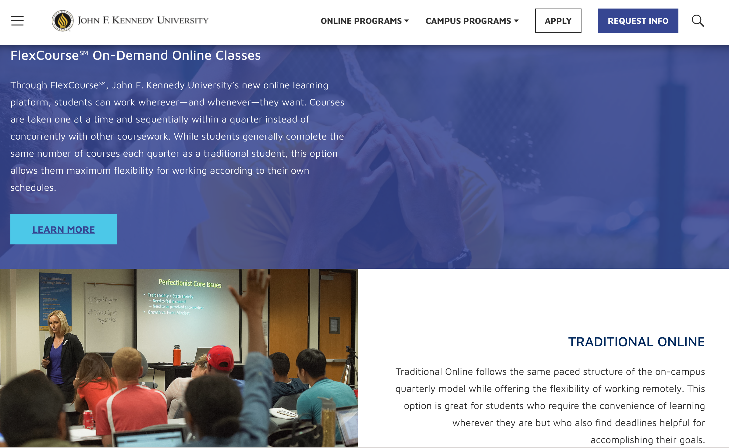
The website redesign was part of a rebrand that included steering away from the current site’s for-profit look and toward one that more accurately reflected the personality of the university, a nonprofit experience geared toward making a higher education accessible to busy working adults.
My role: Lead copywriter
The brand direction and site infrastructure had just been established when I joined the tiny marketing team as their sole copywriter.
I conducted extensive interviews with program chairs and department heads to discover the key points of their programs and the language that resonated most with each of their prospective student groups. I then rewrote all long-form content and CTAs for most pages throughout the website, focusing on transforming content from information dump to conversation starter, offering an overview of only the most essential points needed by the prospective student to proceed to the next step of their journey.
Whereas previous iterations of copy had either been too corporate or too academic, I crafted a voice poised between the two that suggested rigor yet was nonetheless down-to-earth, accessible, and direct.

The (very high) impact
75% increase in conversion within the first week of the site’s launch
The website received a Bronze award in the 34th Annual Educational Advertising Awards


Consciousness Studies CTA

Holistic Psychology CTA

Legal Studies CTA

PSYD CTA